A rhythm of delicate waves
The light, repeating wave pattern gives the white napkin depth. Up close, the fine lines become visible; on the table, the overall effect stays calm and light.
 Order via InOne

The restaurant
In the historic heart of ’s-Hertogenbosch, on Sint Jansstraat beside the Dommel, Shintori invites guests to discover Japanese cuisine together. Sushi, sashimi and hot dishes follow one another: a table full of different flavours, with time to taste and share.
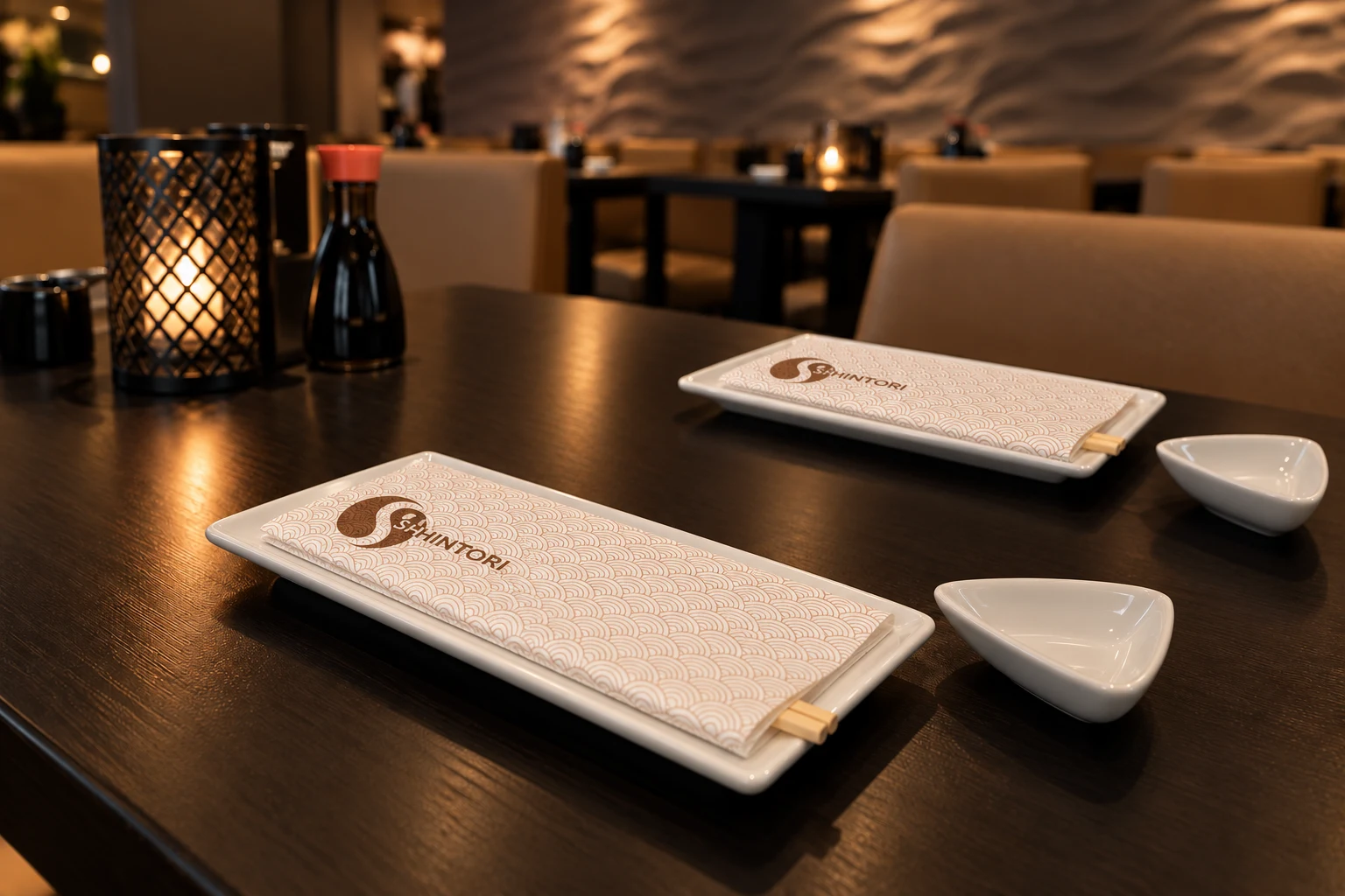
Inside, dark tables, warm sandy tones and soft lighting set the scene. The textured wall brings movement to the room without disturbing its calm. In a setting like this, the details on the table matter: a napkin should be practical, but also feel naturally at home in the restaurant.
The products
Explore the product versions with the customer’s own artwork. Open a photo to see the printing in detail.
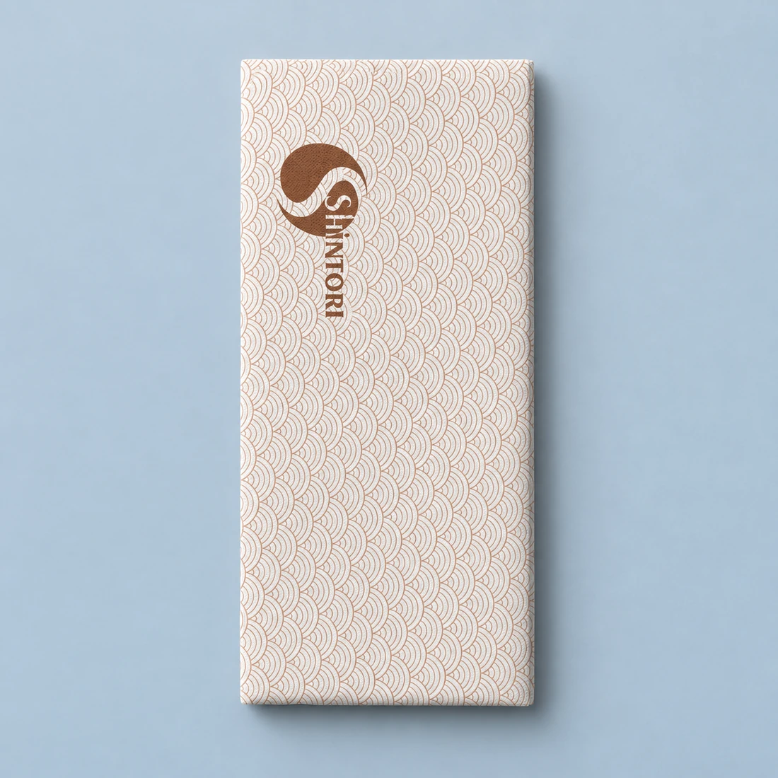
White · 40 × 40 cm · 1/8 fold
Something like this for your business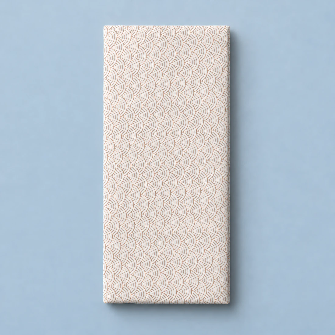
The delicate wave pattern continues
Something like this for your business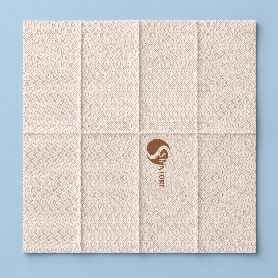
The complete design
Something like this for your businessProduct visualisations based on customer artwork. Lifestyle images are generated impressions; specifications are always confirmed with a product proof.
Printing technique
For De Huyskamer and Shintori, we chose full-surface printing with a laser sleeve. This specially produced printing form makes it possible to print the pattern right to the edge of the napkin, creating one continuous design without an unprinted border around it.
The napkin design
The design distils the restaurant’s character into three elements: a delicate pattern, a warm colour and a recognisable logo. Not a separate advertising space, but part of the table setting.
The light, repeating wave pattern gives the white napkin depth. Up close, the fine lines become visible; on the table, the overall effect stays calm and light.
The Shintori logo in a warm brown tone forms a clear focal point. It complements the natural colours of the interior and contrasts with the light background.
The airlaid napkin measures 40 × 40 cm unfolded and has a 1/8 fold. The elongated visible panel brings logo and pattern together in a compact table presentation.
02 · The product
The continuous pattern and Shintori logo turn an everyday item into a recognisable part of the restaurant. The soft airlaid material adds a refined touch without drawing attention away from the dishes.
The rectangular plates sit widthways in front of each guest. Disposable wooden chopsticks are tucked between the thin folded napkin layers, with a small white soy sauce dish alongside.
The result
On the white plate, against the dark tabletop, the design comes into its own. The light waves create rhythm; the warm logo brings recognition. The napkin connects Shintori’s visual identity with the moment guests take their seats.
Behind the scenes
A beautiful product range also needs to work during service and be easy to reorder. We guide material selection, print proofs and production, and discuss how stock and replenishment can fit daily operations.
Materials, colours and printing matched to your business.
We agree stock levels and repeat production based on usage.
Split deliveries at an agreed pace, according to your arrangements.
More table stories
BrandTable by Proper Products
From printed napkins and cutlery pouches to greaseproof paper and engraved glassware. Choose your products, add your artwork and receive a personal proposal. We help with the specification and delivery.
Comments
Question or experience with this project
Share a relevant question or practical experience. Every comment is reviewed by Proper Products first.
Loading comments…